BATA
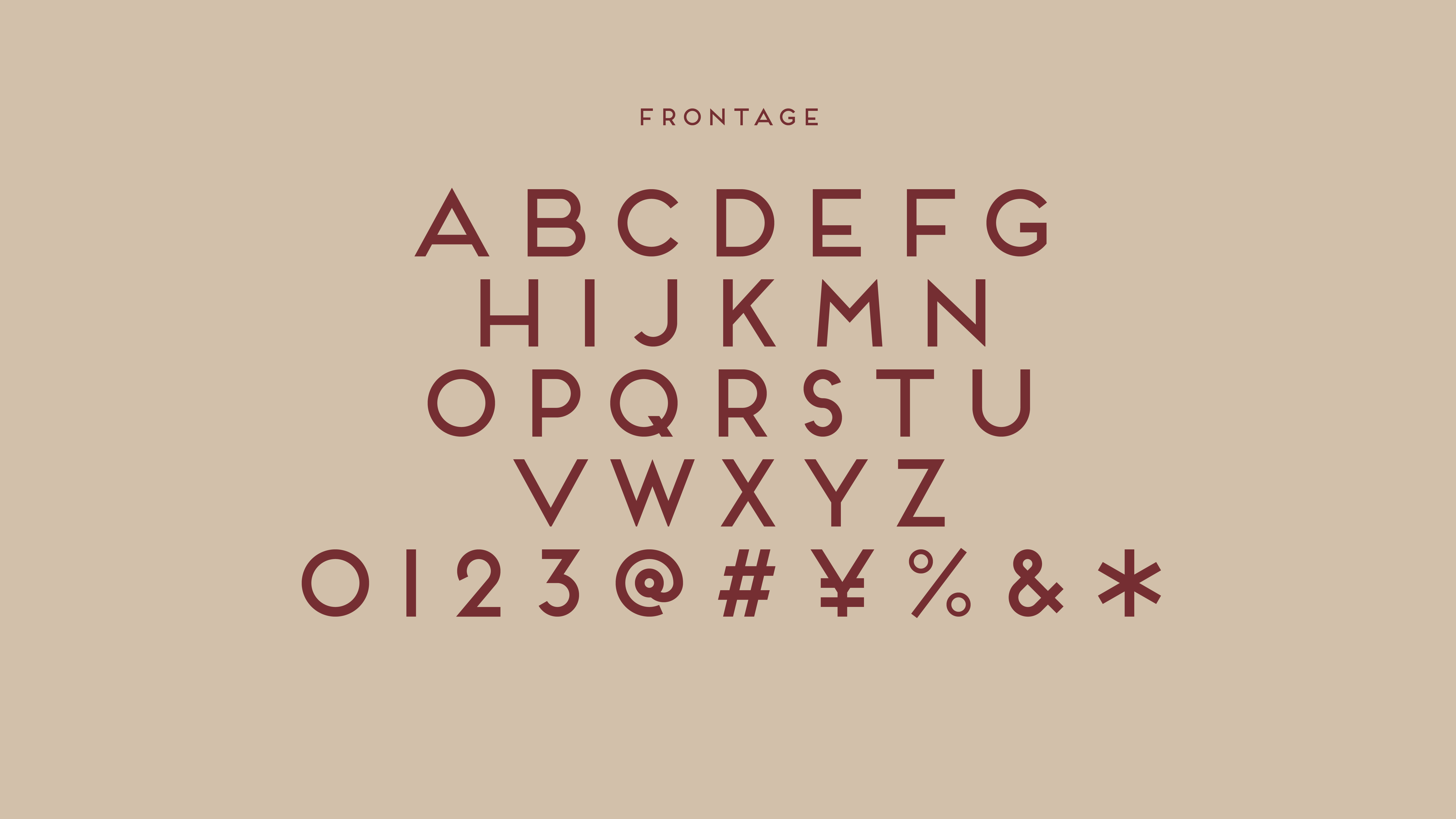
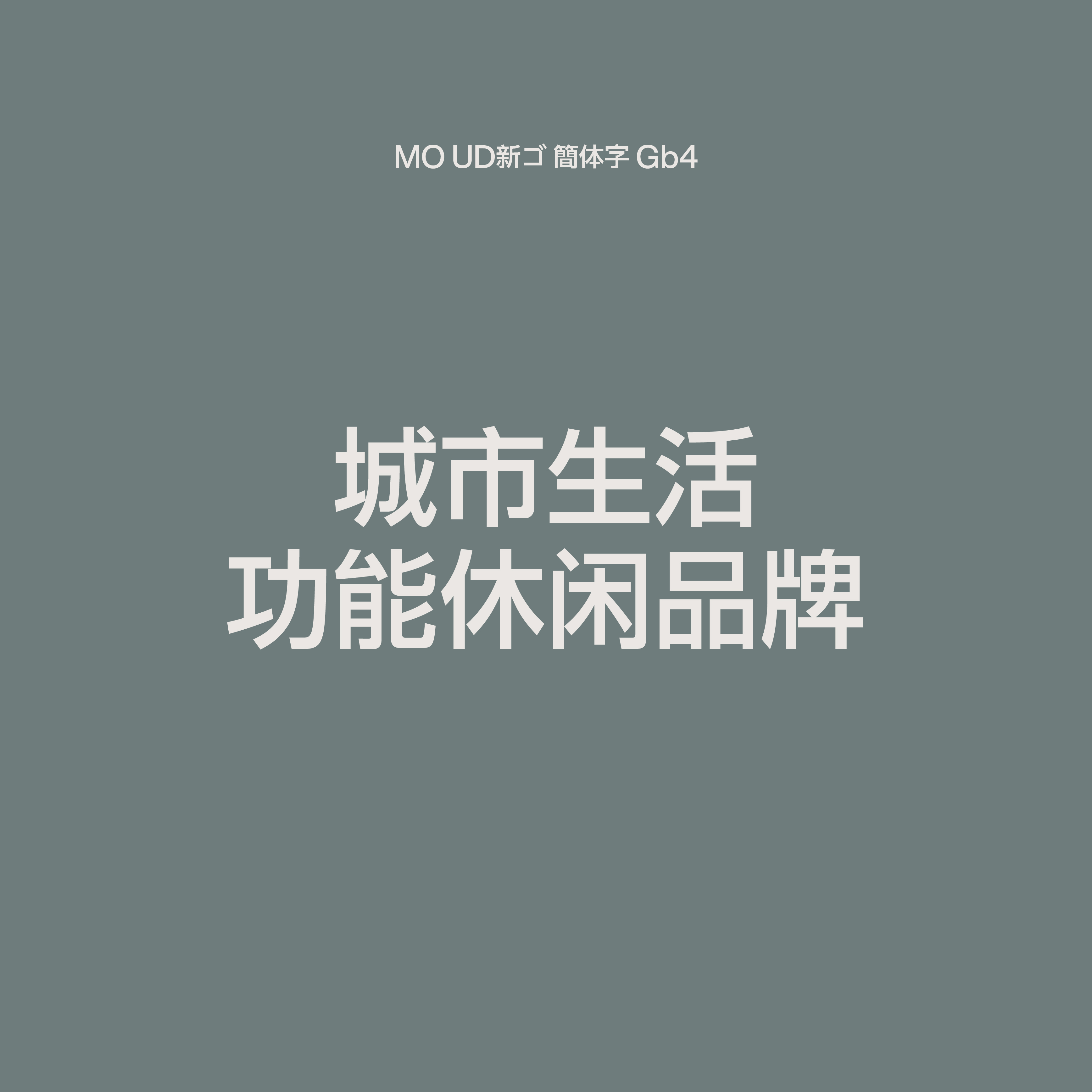
我们以系统化的设计方法, 将品牌的全球视觉基因与中国市场的文化语境进行融合。从中英文字体选择、色彩心理、到版式网格系统, 每一处视觉元素都经过本土化重构与精确的标准化定义。
We employed a systematic design approach to merge the brand’s global visual DNA with the cultural context of the Chinese market. From the typeface system and color psychology to layout structure and grid systems, every visual element was reinterpreted for local relevance and precisely standardized.
Brand Identity品牌视觉Packaging包装E-Commerce Design电商视觉
Creative Direction艺术指导AD/CD: Yimin Zhao|Jianwen Cui
D: Yimin Zhao|Jianwen Cui|Jianan pan|Chijin Liu|Liansheng Zhu
3D: BBLW
Creative Direction艺术指导AD/CD: Yimin Zhao|Jianwen Cui
D: Yimin Zhao|Jianwen Cui|Jianan pan|Chijin Liu|Liansheng Zhu
3D: BBLW
BATA
中国|捷克
2025


中国, 深圳
2025
2025
我们以系统化的设计方法, 将品牌的全球视觉基因与中国市场的文化语境进行融合。从中英文字体选择、色彩心理、到版式网格系统, 每一处视觉元素都经过本土化重构与精确的标准化定义。
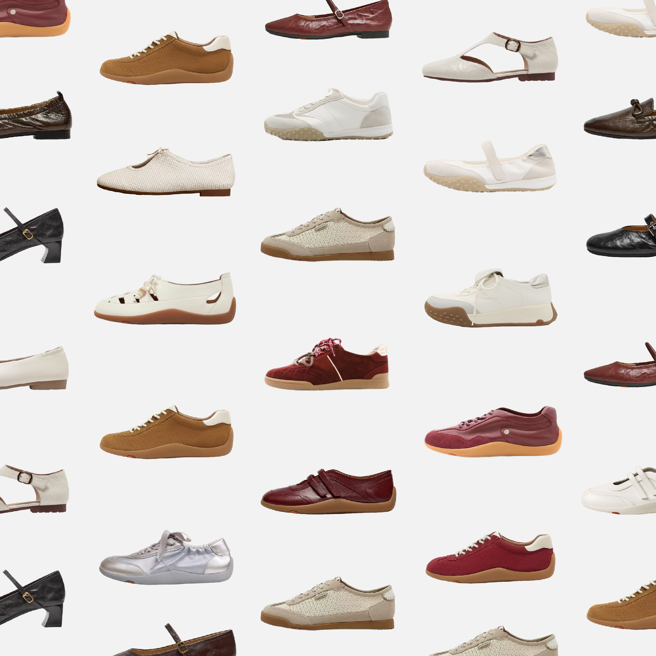
在这一过程中,我们构建了完整的视觉资产,并针对各个触点—包括包装、电商平台及传播物料—制定了可直接落地的设计规范。由此,品牌在中国市场的每一次亮相都保持高度一致的形象表达与符合本土审美的适配性,为后续的市场传播和多渠道延展奠定了稳固的设计表达。
We employed a systematic design approach to merge the brand’s global visual DNA with the cultural context of the Chinese market. From the typeface system and color psychology to layout structure and grid systems, every visual element was reinterpreted for local relevance and precisely standardized.
In this process, we built a comprehensive set of visual assets and developed ready-to-implement design guidelines for all key touchpoints—including packaging, e-commerce platforms, and communication materials. This ensures that every appearance of the brand in the Chinese market maintains a highly consistent visual expression and aligns with local aesthetic preferences, establishing a solid foundation for future marketing communications and multi-channel extensions.