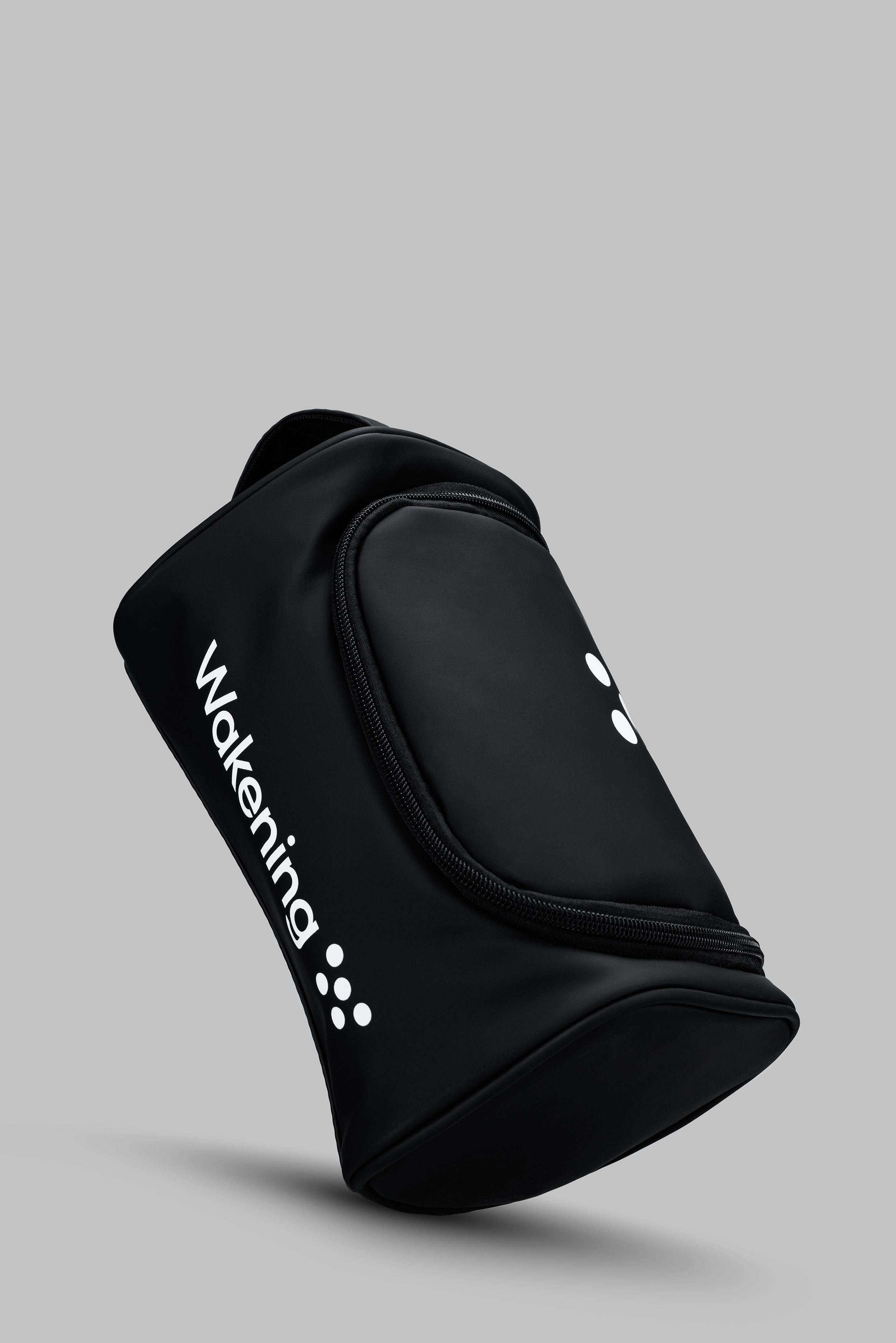
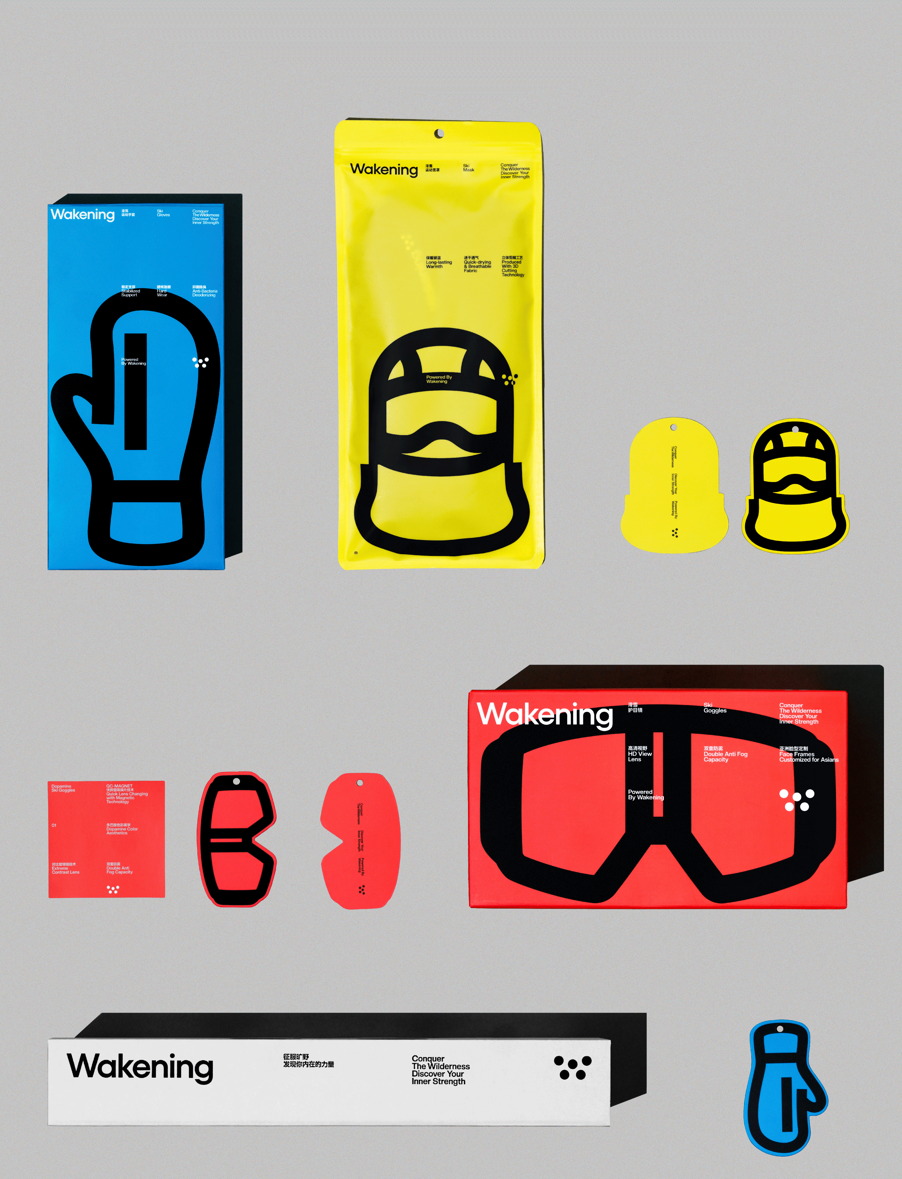
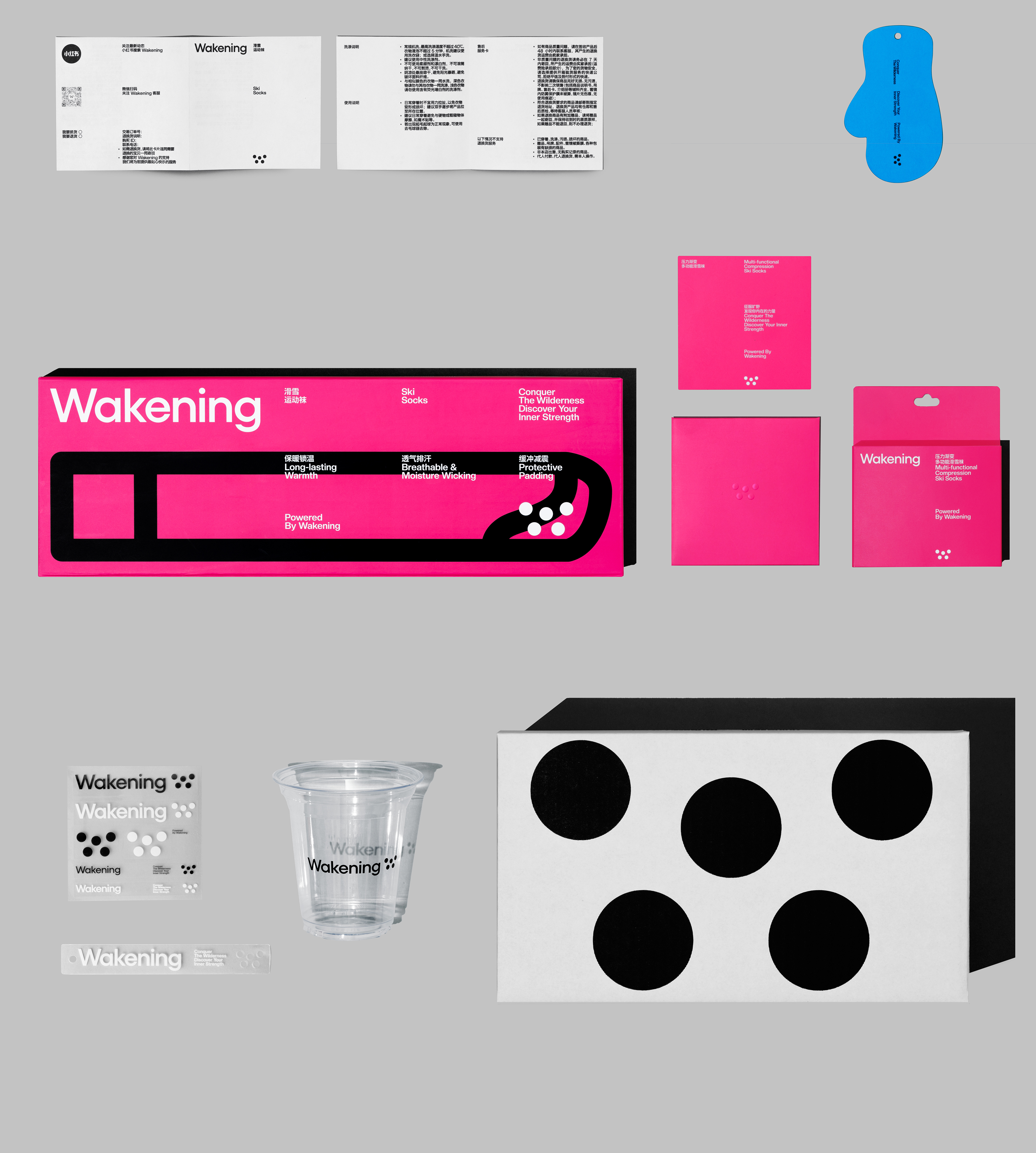
WAKENING
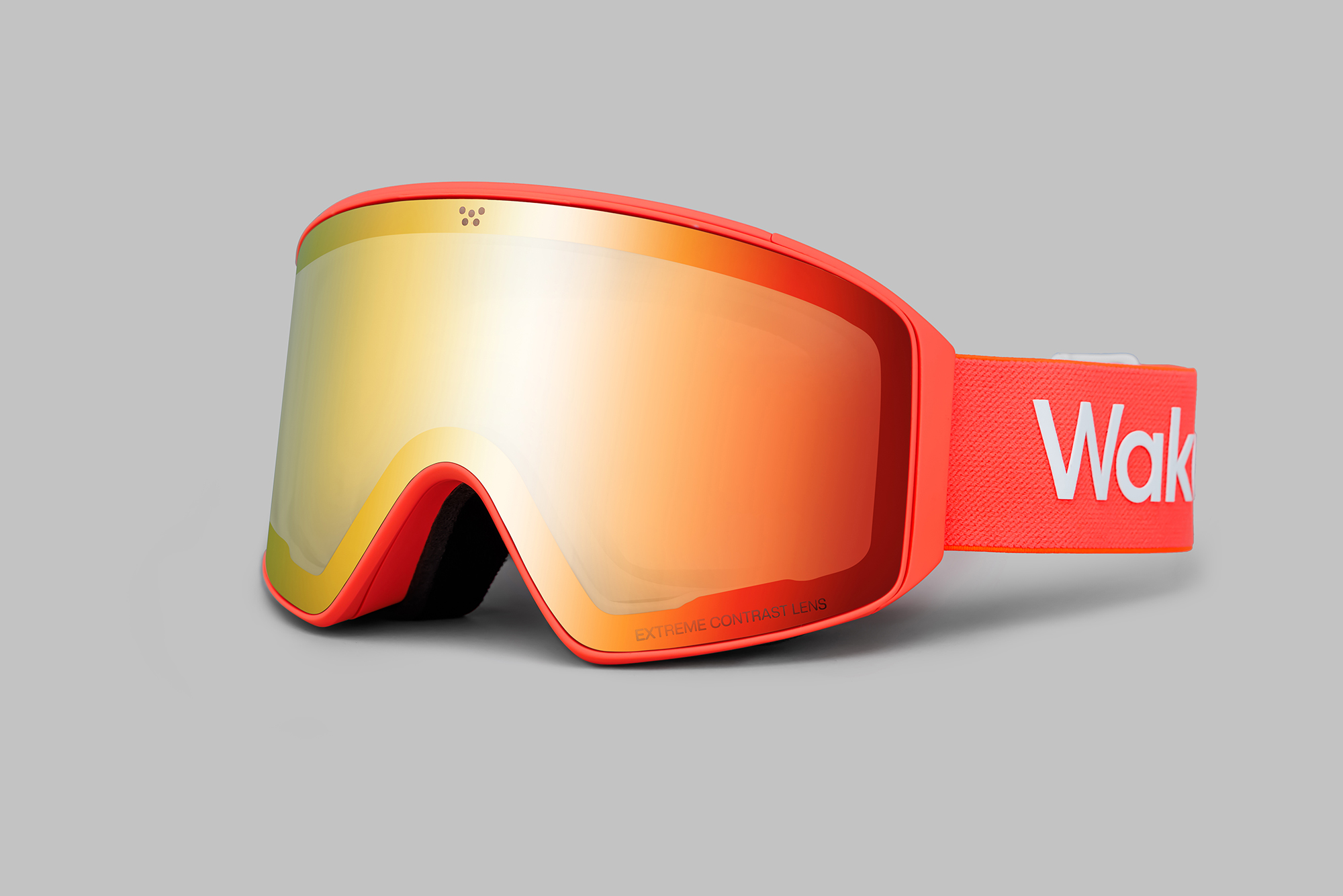
W是一个攀升的几何, 5源点与5个栏位塑造秩序与平衡。在运动轨迹中, 找到自己的切线, 极值与收敛。
W is an ascending geometry, where five grid points and five column layouts forge order and balance. Along the trajectory of motion, discover its tangent, extrema, and convergence.
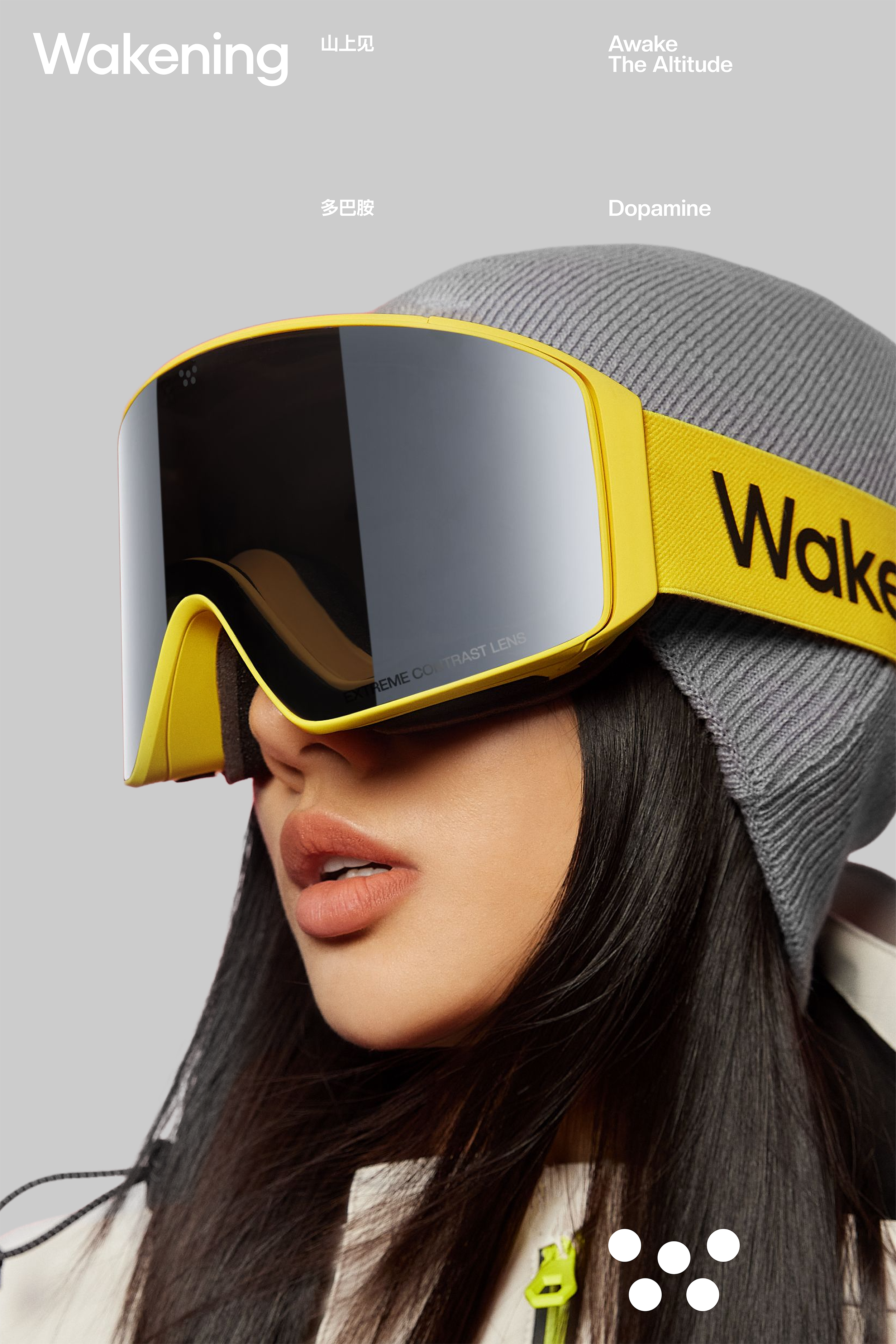
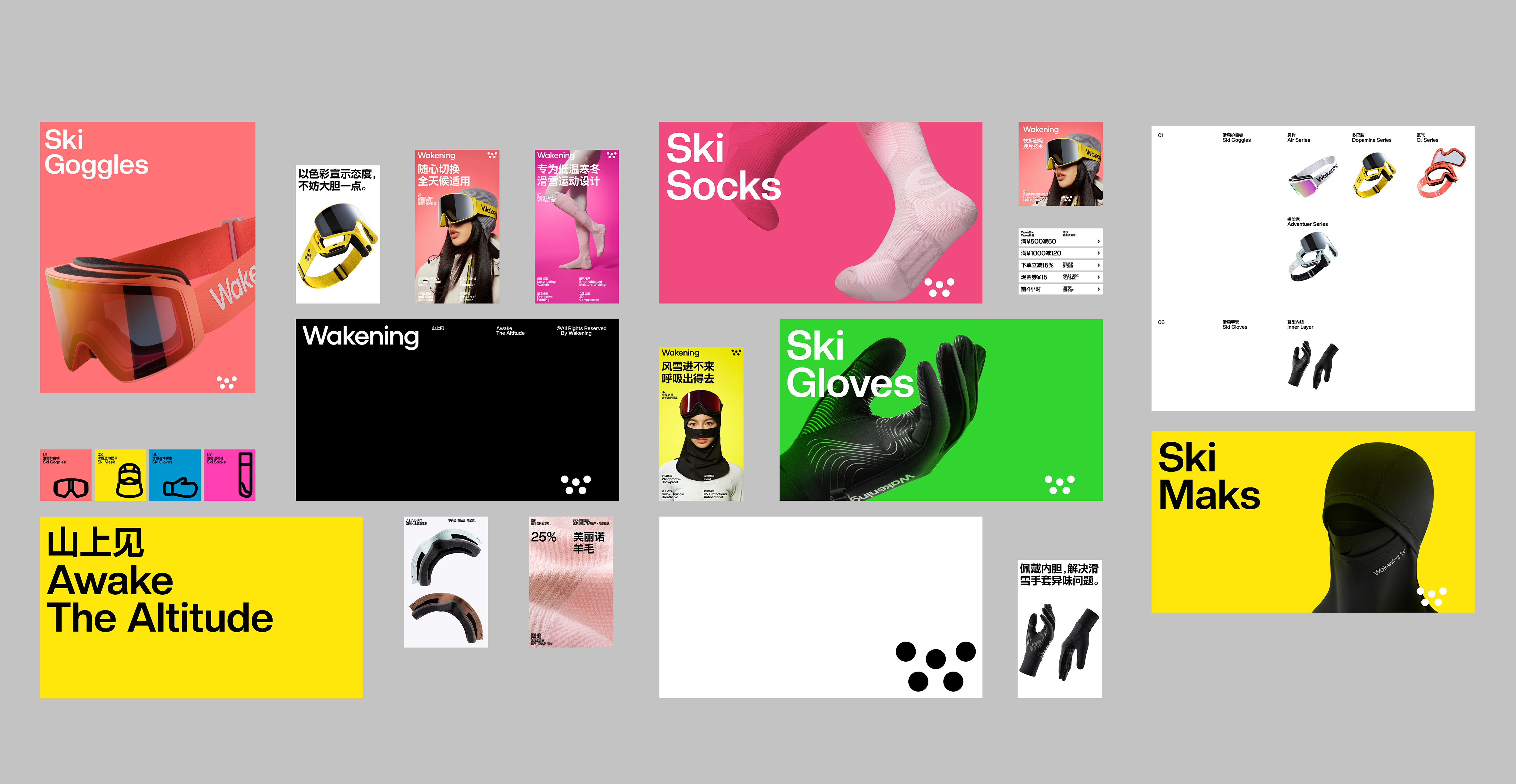
山上见。
Awake the Altitude.
Pentawards Gold Award 2025
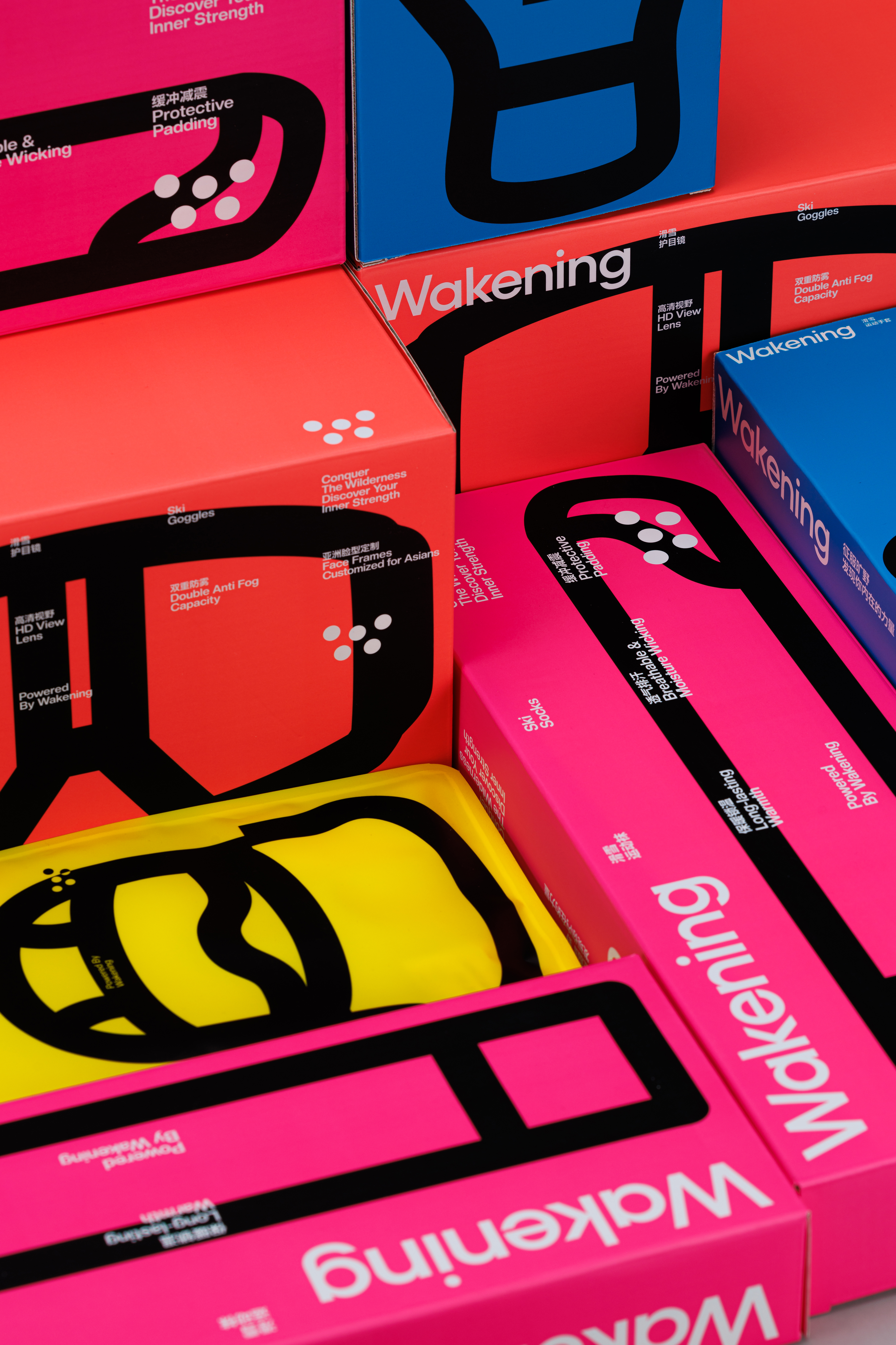
Brand Identity品牌视觉
Packaging包装
Creative Direction艺术指导
Strategy 品牌策略
WAKENING 是一个面向亚洲用户的户外服饰与高海拔运动装备品牌, 核心围绕滑雪场景展开,并具备向骑行、登山、徒步、越野跑及城市轻运动等场景延展的可能。Studioenok 为 WAKENING 建立了一套以五个点和五栏网格为核心的品牌视觉系统。五个点构成了类似 “W” 的上升几何形态, 既回应山脉起伏的轮廓,也象征身体在速度、重力与判断之间不断修正的运动轨迹。字母 “W” 不只是 “Wake” 的开端, 它也代表品牌试图唤醒人们对高度、速度与自我挑战的感知。基于这一系统, 我们并未将包装视为一个外在的装饰层, 而是将其作为品牌视觉系统的延伸。五点逻辑与五栏结构共同决定了信息的位置、版面的节奏, 以及结构与运动之间的关系, 使品牌在技术性、精确性与高海拔运动的情绪体验之间建立起清晰而持续的连接。
WAKENING is an outdoor apparel and high-altitude performance gear brand designed for Asian users. Rooted in skiing, the brand also has the potential to extend into cycling, mountaineering, hiking, trail running, and urban light outdoor activities. Studioenok developed a visual identity system for WAKENING based on five points and a five-column grid. The five points form an ascending “W”-like geometry, echoing both the contour of mountain ranges and the trajectory of a body constantly adjusting itself between speed, gravity, and judgment. The letter “W” is not merely the beginning of “Wake”; it represents the brand’s intent to awaken people’s awareness of altitude, speed, and self-challenge. Based on this system, packaging was not treated as an external decorative layer, but as an extension of the brand’s visual identity. The five-point logic and five-column structure define the placement of information, the rhythm of layout, and the relationship between structure and motion, creating a clear and continuous connection between technical precision and the emotional experience of high-altitude movement.