CEELIKE
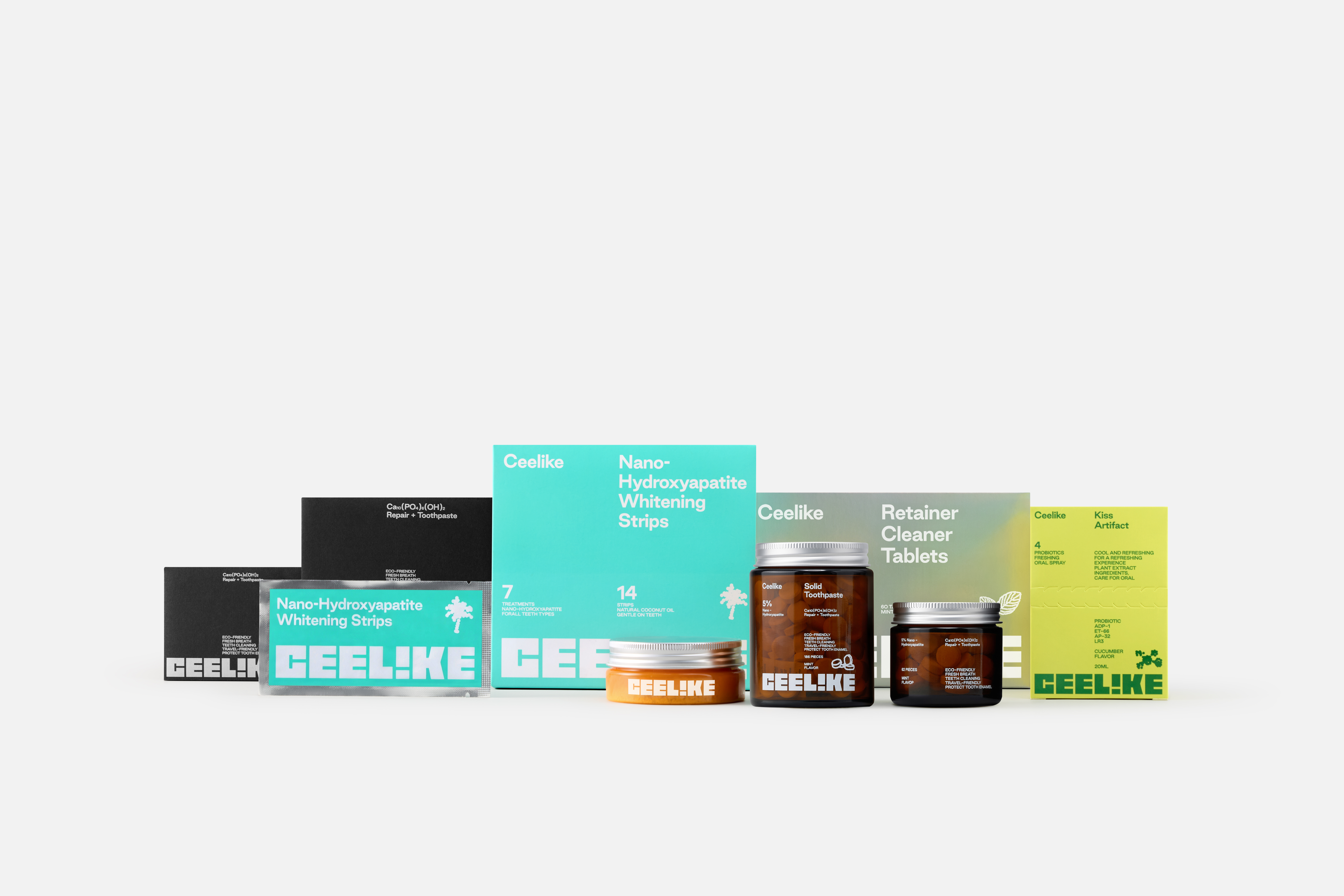
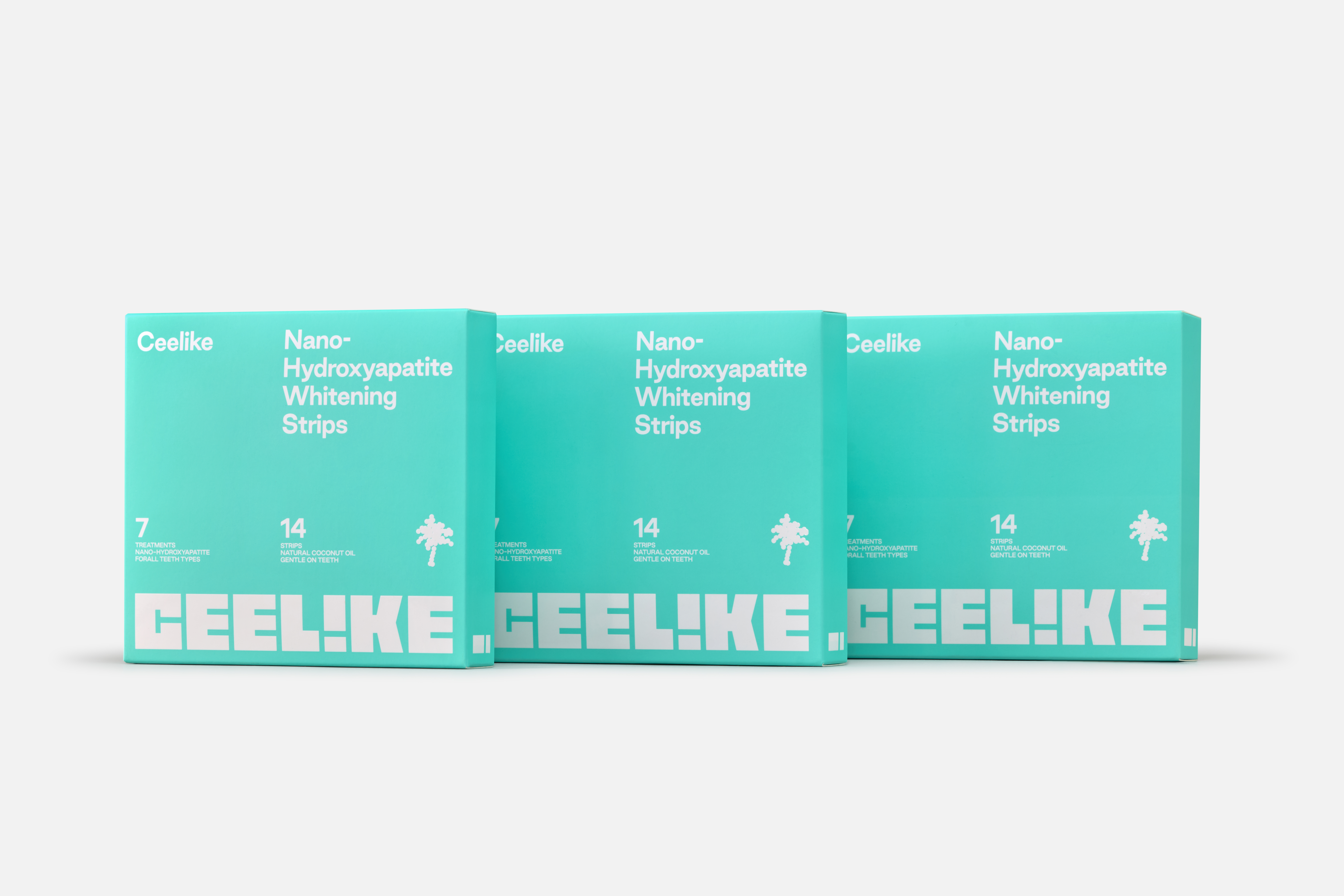
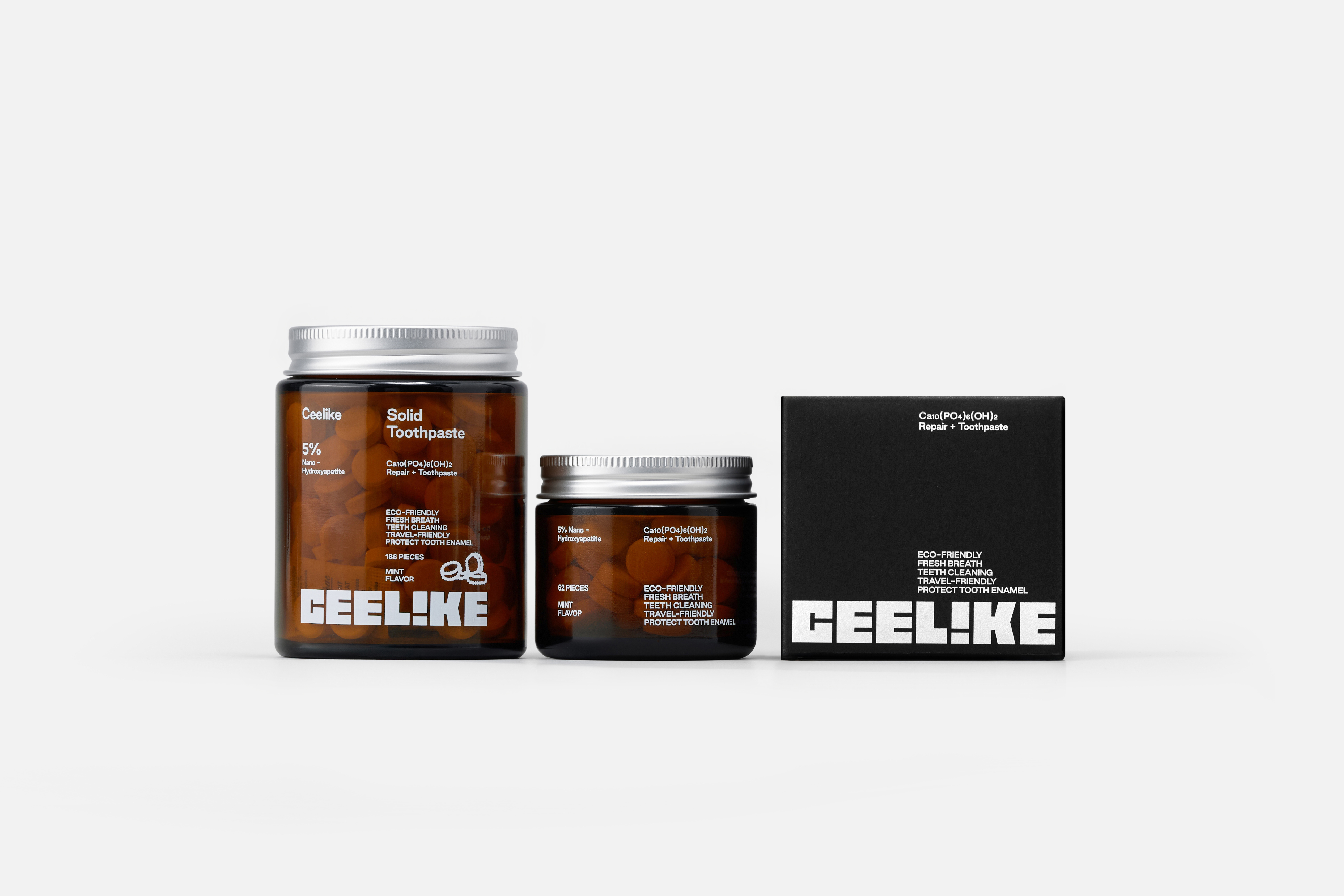
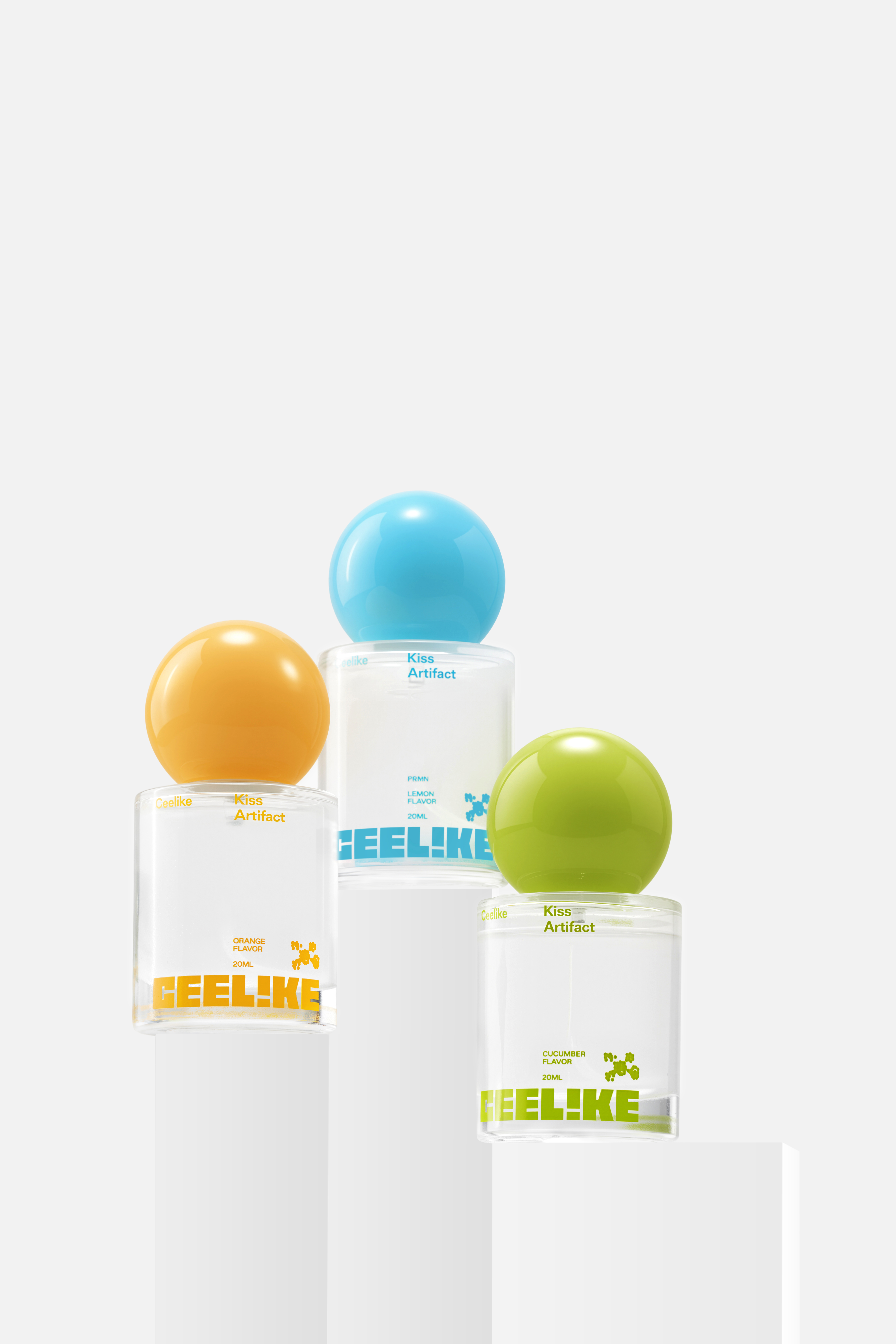
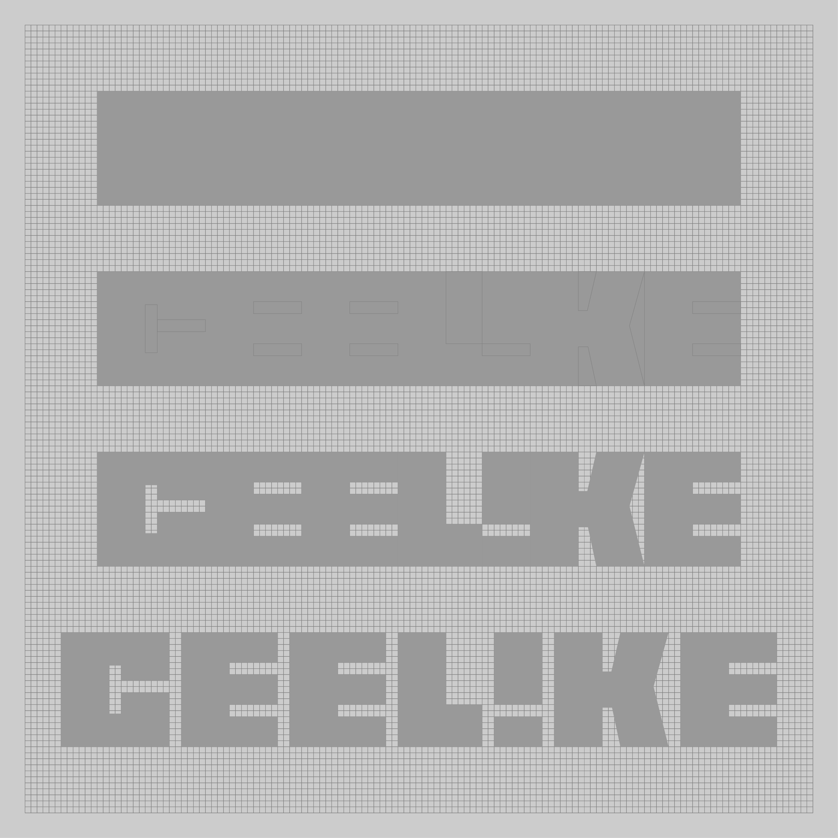
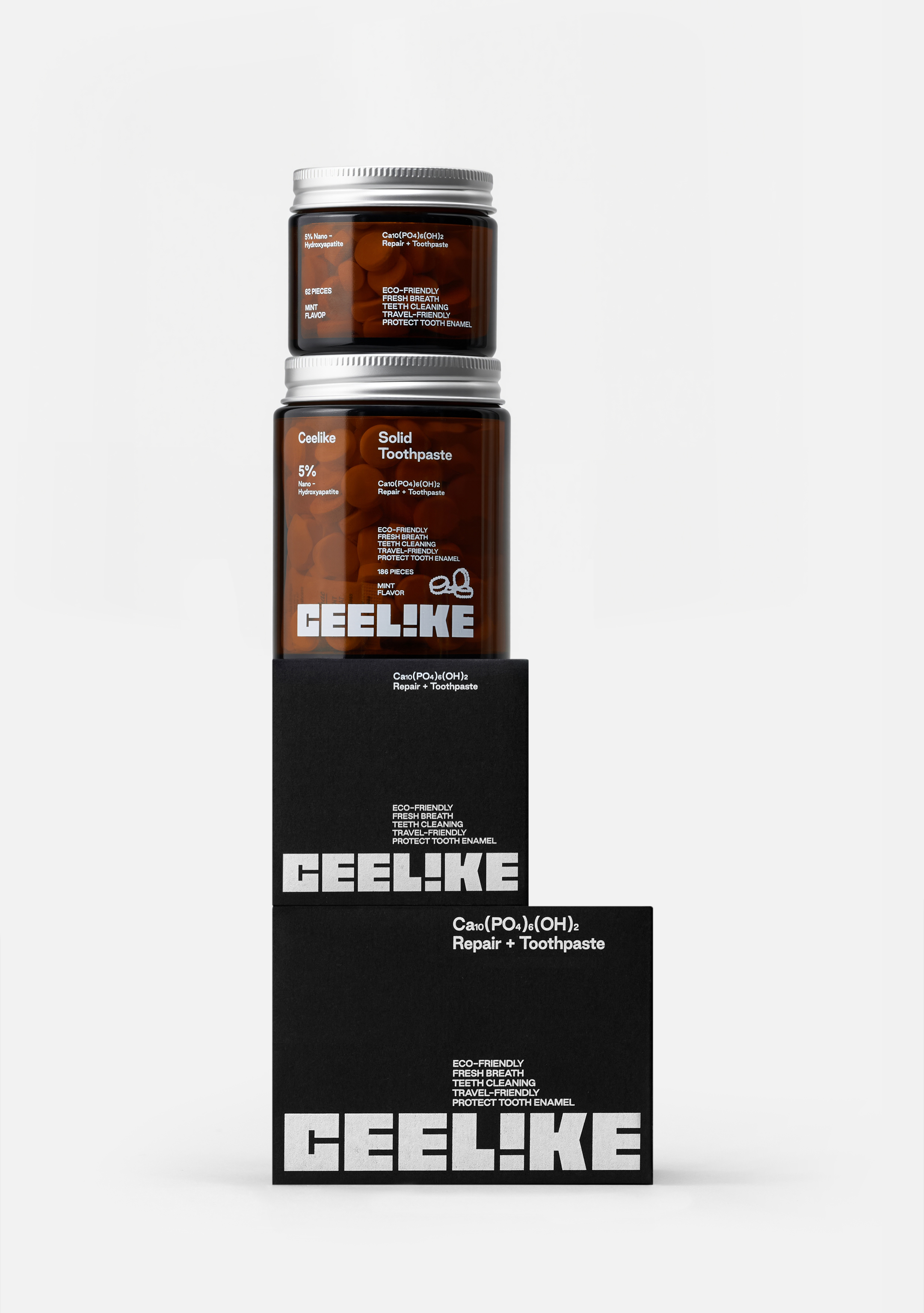
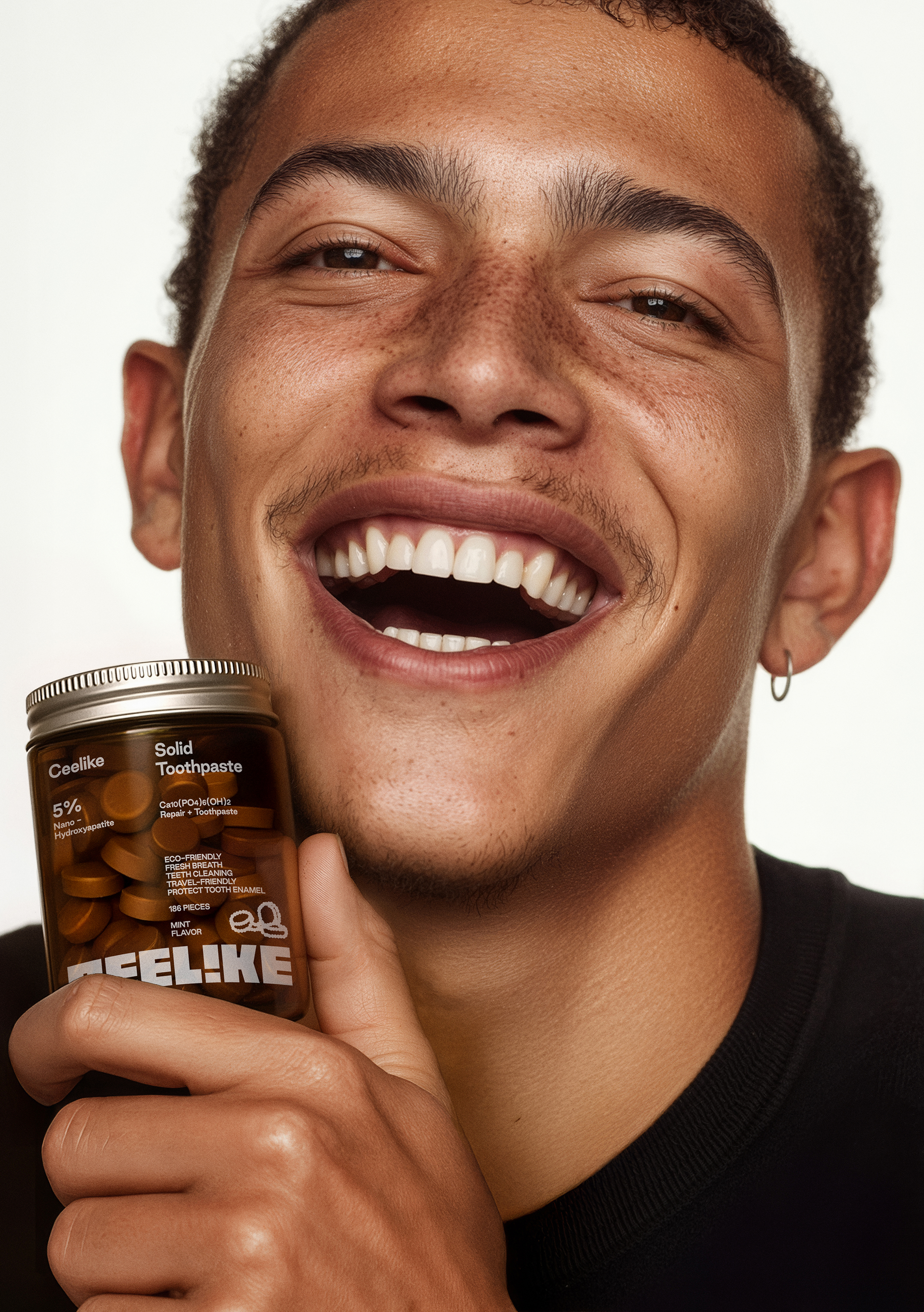
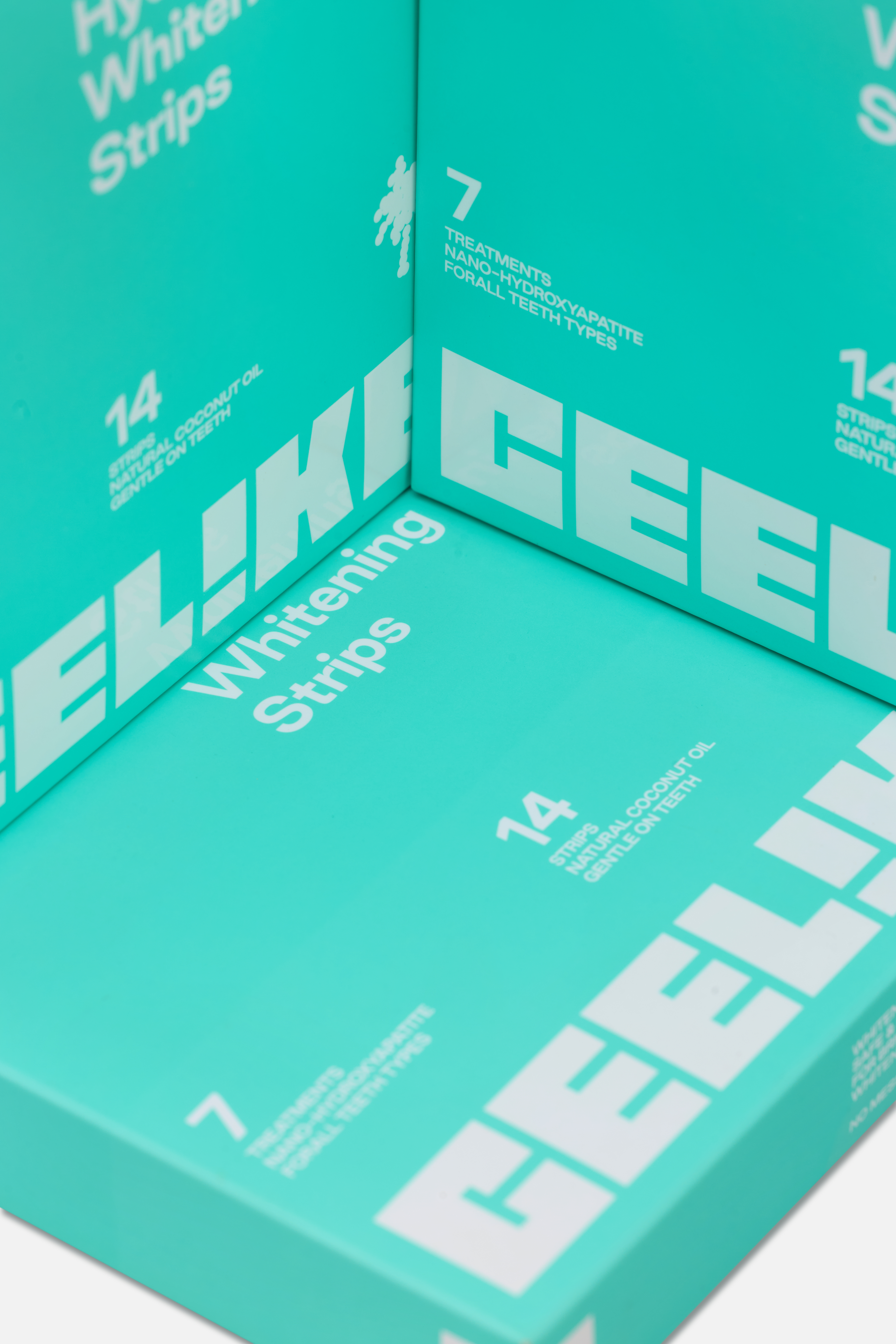
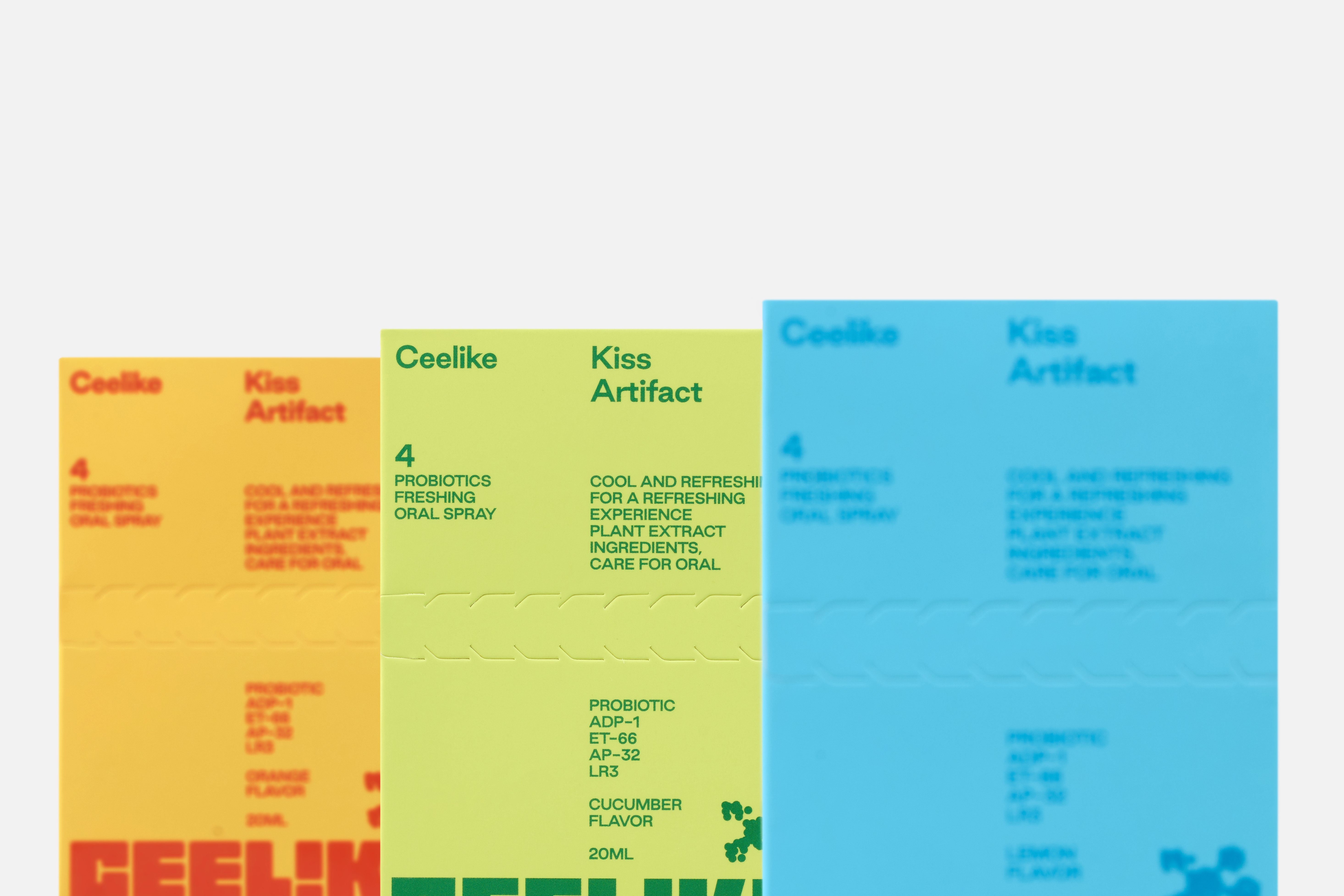
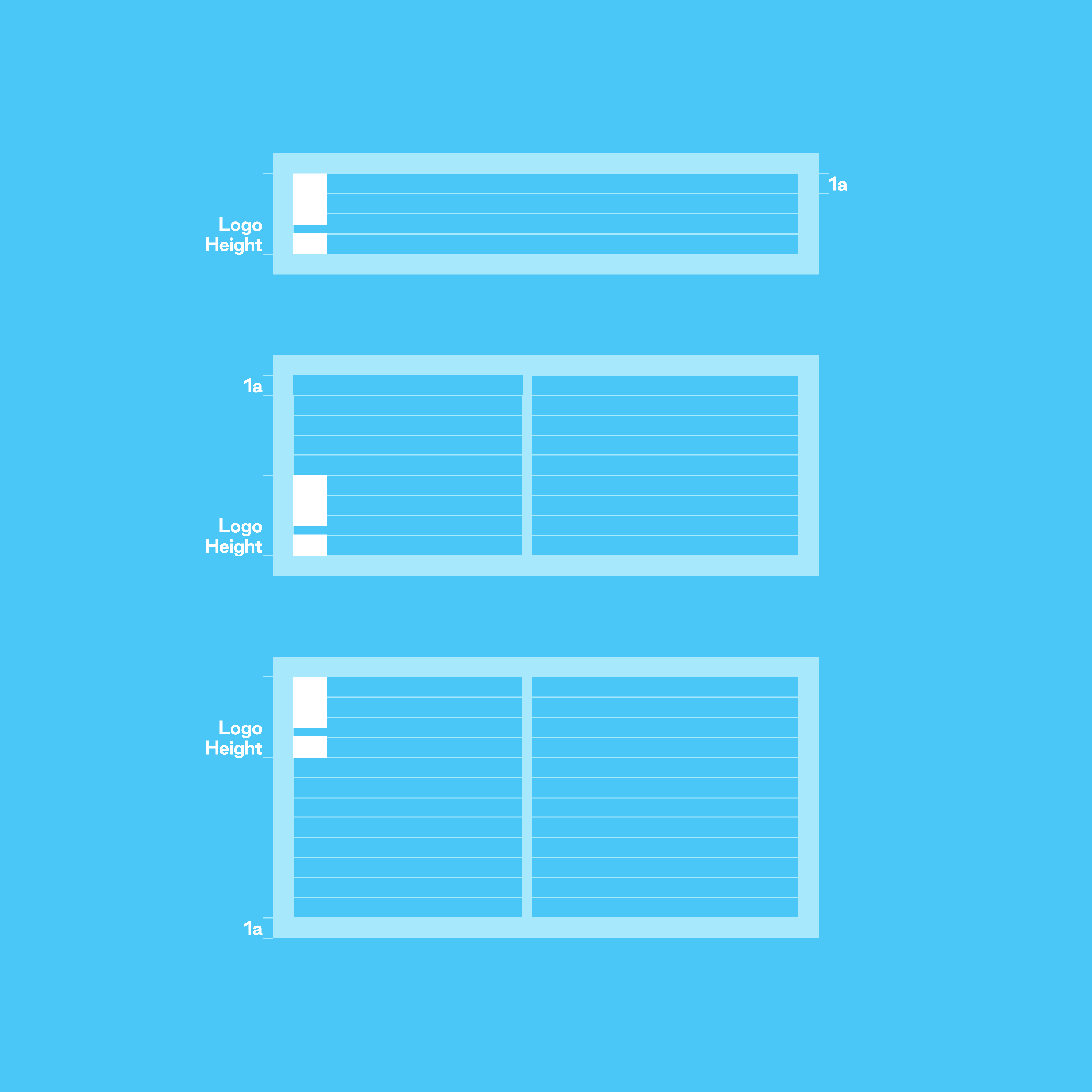
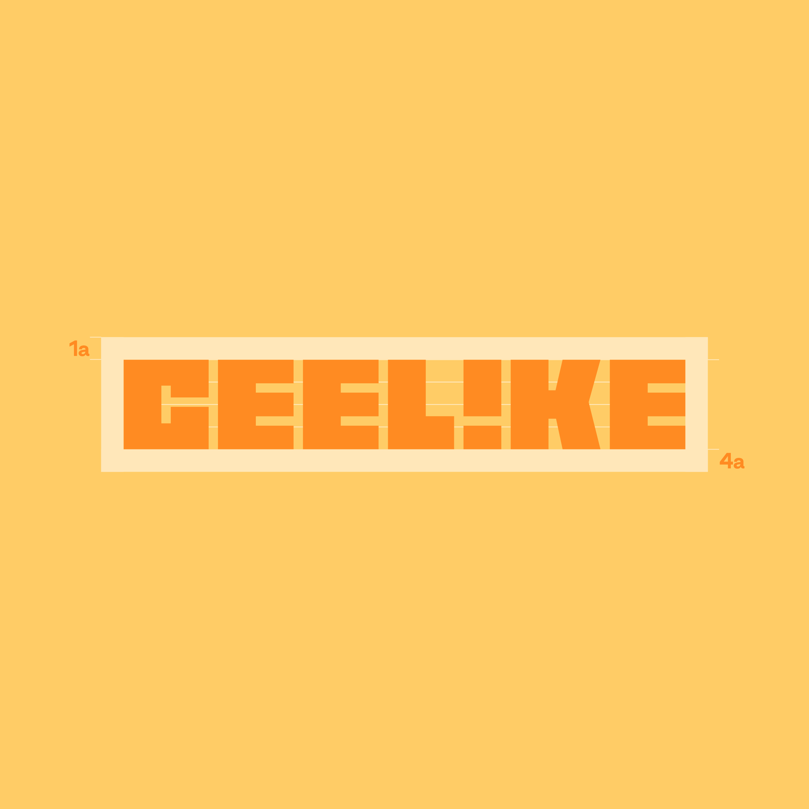
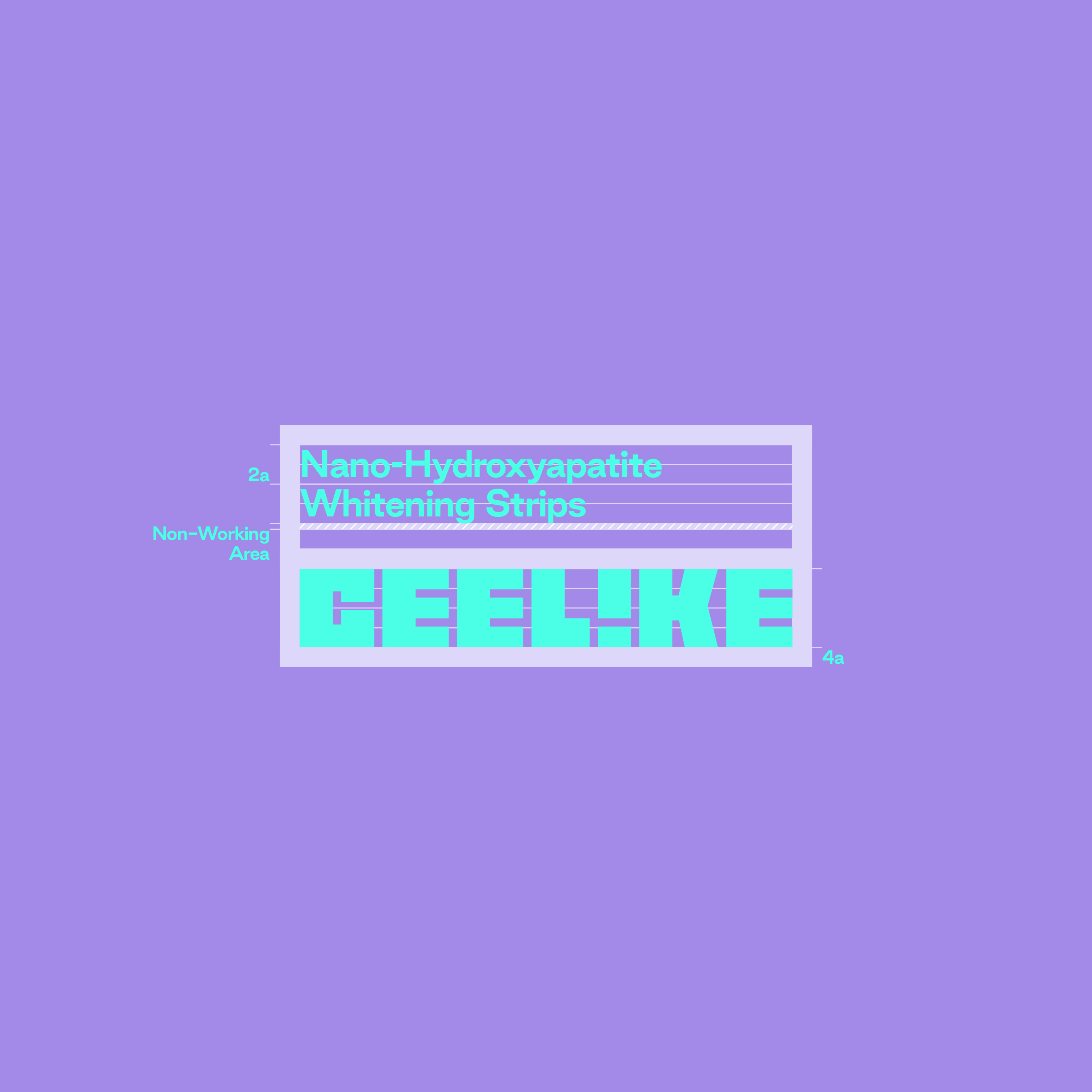
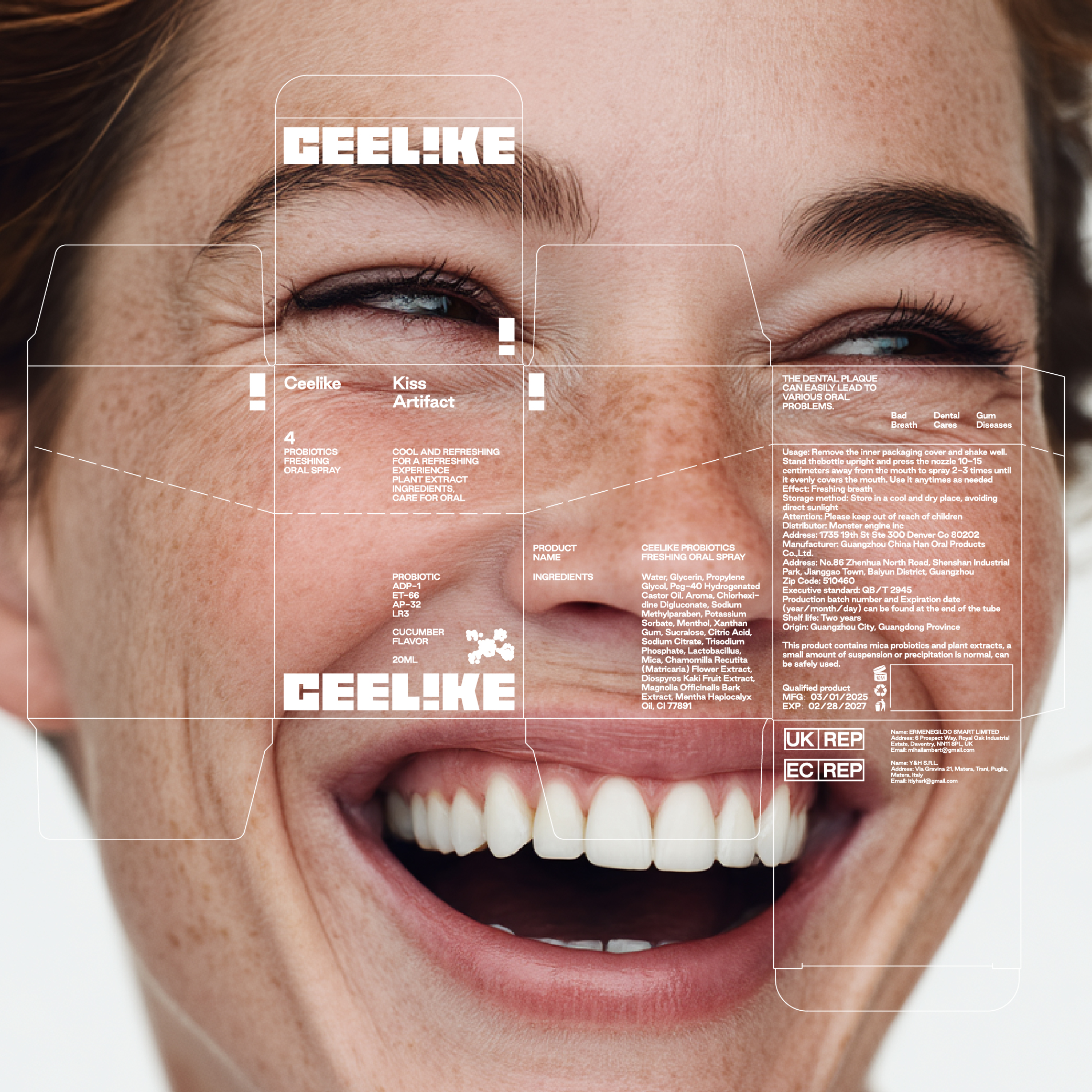
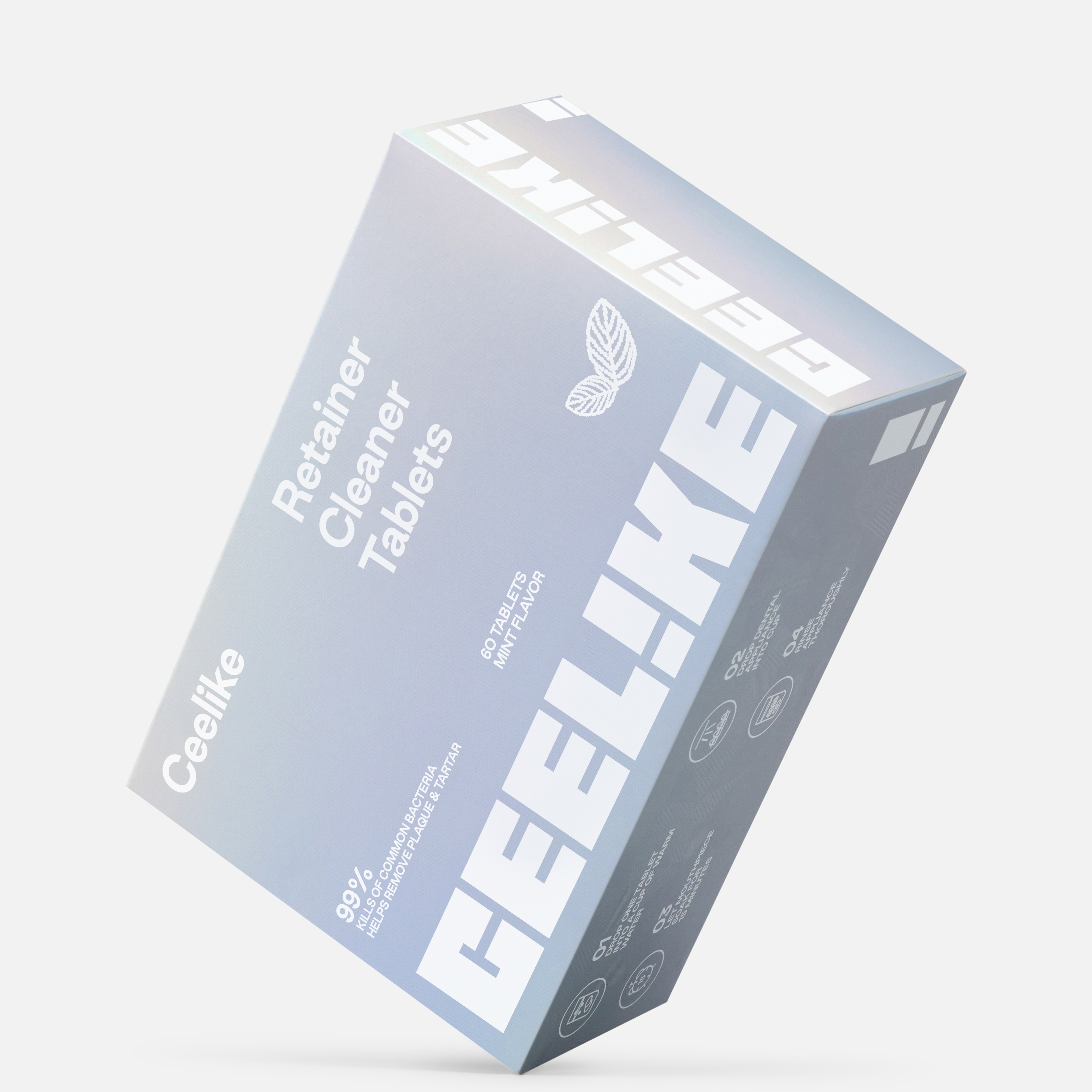
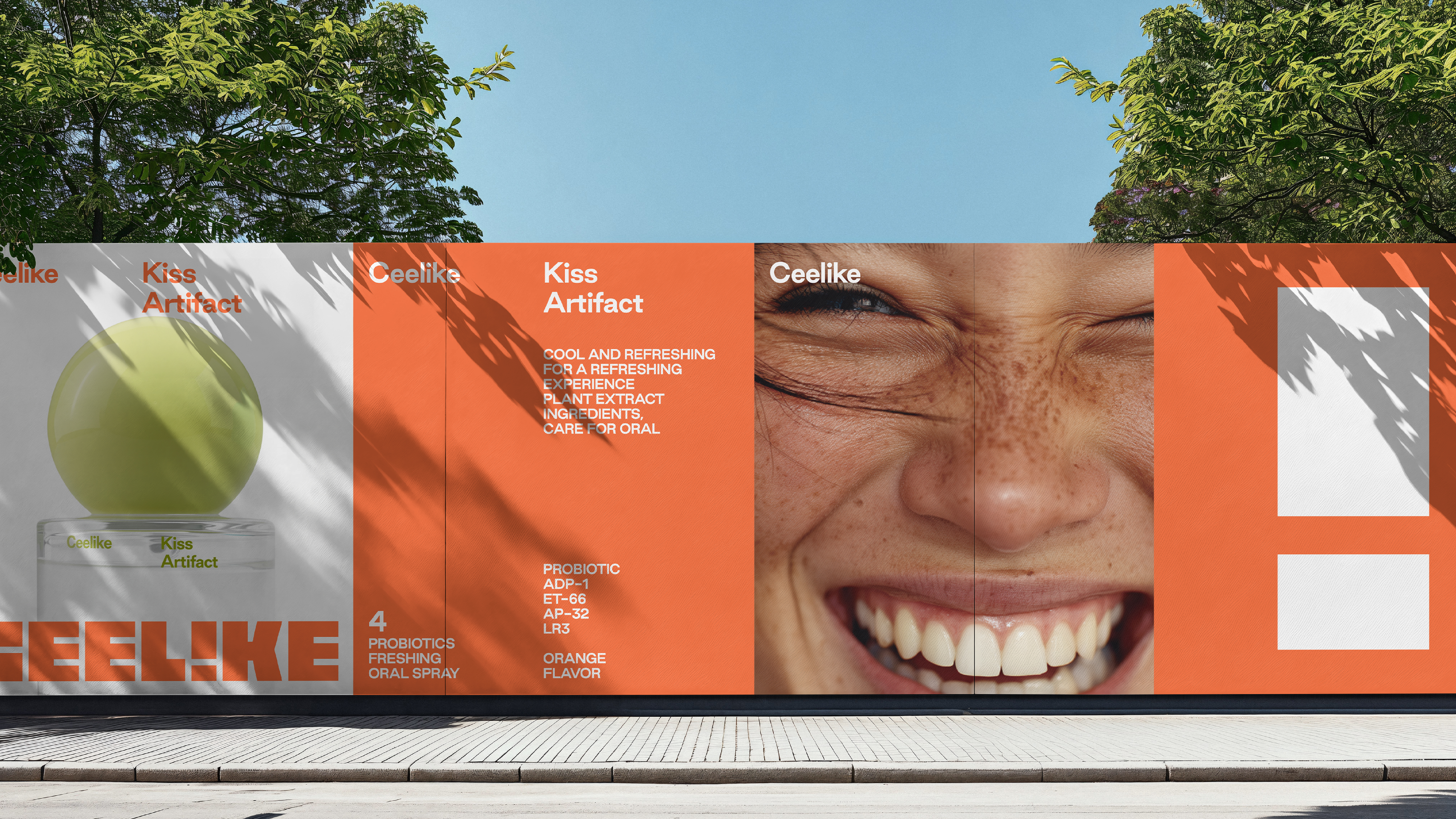
Studioenok 为 Ceelike 打造了一套完整的口腔视觉系统 , 同时基于口腔这个特殊类目, 为生活线和专业线拓展了视觉边界 , 涵盖了形象/字体/色彩/动态设计/版式原则/艺术指导/科技元素图解等。
Studioenok crafted a holistic visual guideline system for Ceelike, designed to extend the brand’s visual presence across both its lifestyle and professional lines. The system integrates typography, color, motion, layout principles, art direction, and technological diagram elements, forming a cohesive framework for all visual communication.
Brand Identity品牌视觉Packaging包装Creative Direction艺术指导AD/CD: Yimin Zhao|Jianwen Cui
D: Yimin Zhao|Jianwen Cui|Yue Hu|Weitao Yang|Liansheng Zhu
3D: BBLW
D: Yimin Zhao|Jianwen Cui|Yue Hu|Weitao Yang|Liansheng Zhu
3D: BBLW
CEELIKE
China|U.S.
2025






CEELIKE
2025
2025
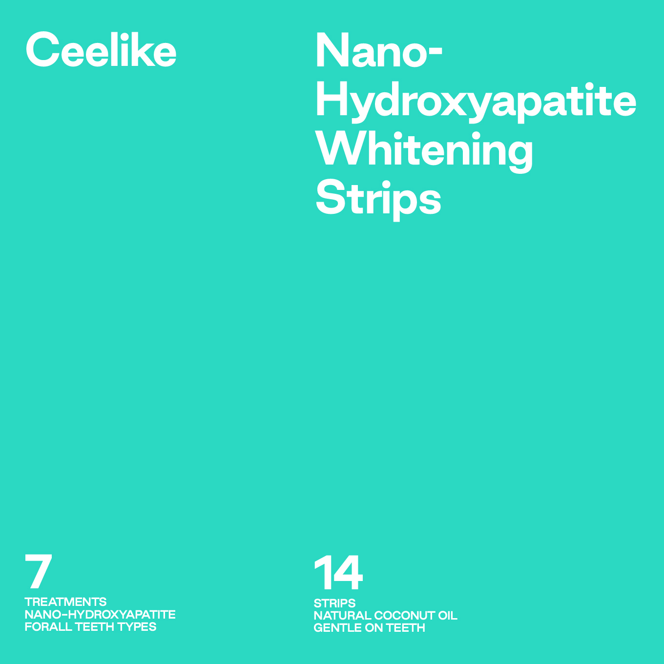
Studioenok 为Ceelike打造了一套完整的视觉指南系统,同时基于生活线和专业线拓展视觉边界,涵盖了字体、色彩、动态设计、版式原则、艺术指导、科技元素图解等元素。
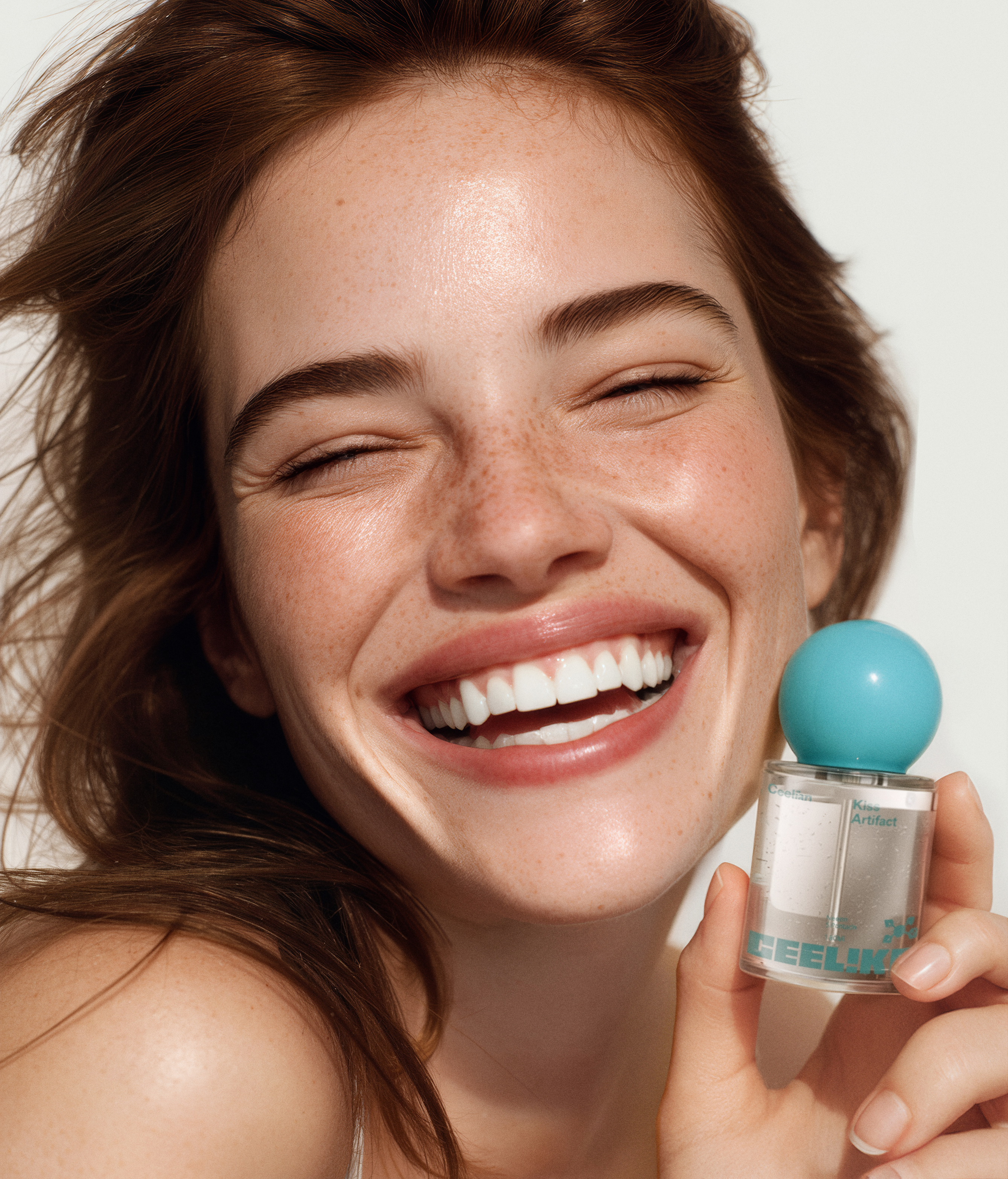
该视觉系统将Ceeike的 “专注口腔”与“关爱生活” 编织为可重复的视觉语言:既具备信息性、顺序性和精准性,在口腔类目中的不断的研究,为拓宽产品表达的可能性,不缺乏惊喜表达也做到了整体感和人性化的表达。
旨在体现Ceelike本身的特质——探索口腔的新表达,以及对生活细节的专注与关爱。
Studioenok crafted a holistic visual guideline system for Ceelike, designed to extend the brand’s visual presence across both its lifestyle and professional lines. The system integrates typography, color, motion, layout principles, art direction, and technological diagram elements, forming a cohesive framework for all visual communication.
At its core, the system translates Ceelike’s dual focus — “dedication to oral care” and “care for everyday life” — into a repeatable visual language. It balances clarity, structure, and precision with moments of surprise and warmth, creating an expressive yet grounded identity. Continuous research in the oral care space informs the system, opening new possibilities for product storytelling while maintaining consistency and a human touch.
This approach embodies the essence of Ceelike: exploring fresh expressions of oral care while reflecting attentiveness and care in every detail of daily life.